

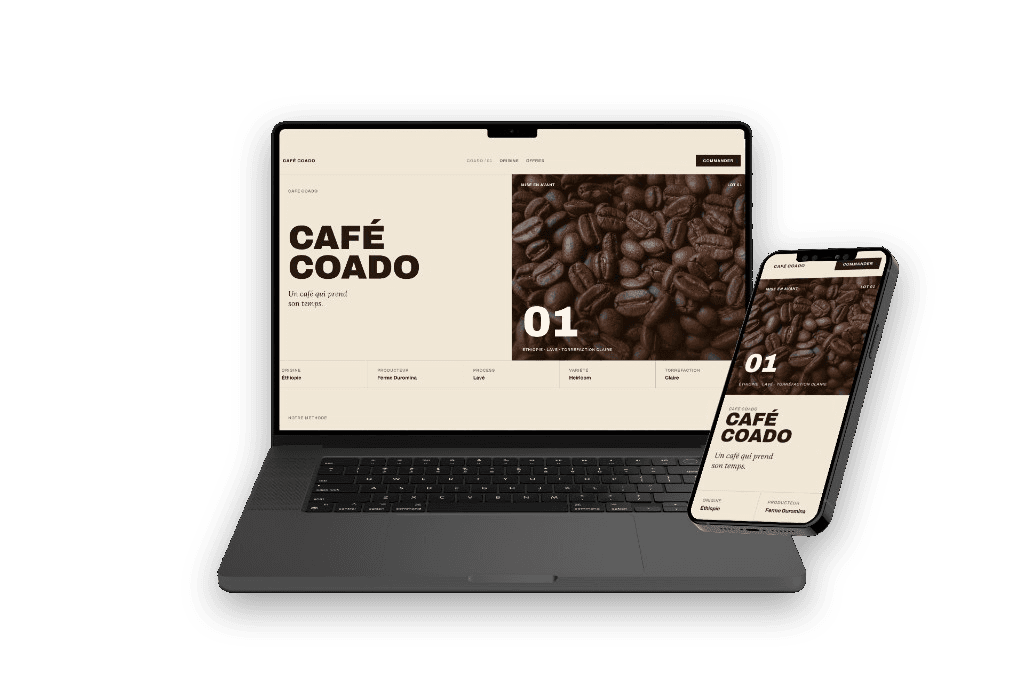

Coffee bar
Café Coado
A fictional coffee bar, treated as an origin product rather than a counter drink. A roaster’s editorial identity: capitals, a touch of italic, a lot of white.
- A header true to the reference, name aside
- A real photo instead of the illustration
- A typographic one-page, self-contained
The project
Café Coado is a fictional coffee bar, treated as an origin product rather than a counter drink. The identity borrows a premium roaster’s editorial language: large capitals, a touch of italic, a lot of white, no extra decoration.
The project started with a simple meeting. Karim was opening a small neighborhood coffee bar. He sent a roaster catalogue with very considered type, and a direct ask: “I want exactly this header, but with my name.”
First pass: the reference structure, one to one — thin nav, large wordmark, visual on the right with a lot number, a specs strip — simply renamed Café Coado, with coffee beans illustrated in-house.
Karim wasn’t convinced by the illustration: “it feels a bit synthetic, I want real coffee that makes you hungry.” We switched to a close-up photo of beans, with a brown veil so it stayed in the mood instead of clashing.
Once the header was signed off, the rest: a method section, a drink selection like a bar list, a footer with hours and address. We stayed with the typographic spirit we started with. The result is a single, self-contained page that sets the tone of the place before you even walk in.
The header I wanted, with my name. And a page that sets the tone of the place before you even walk in.
Karim T.Founder, Café Coado
Other projects

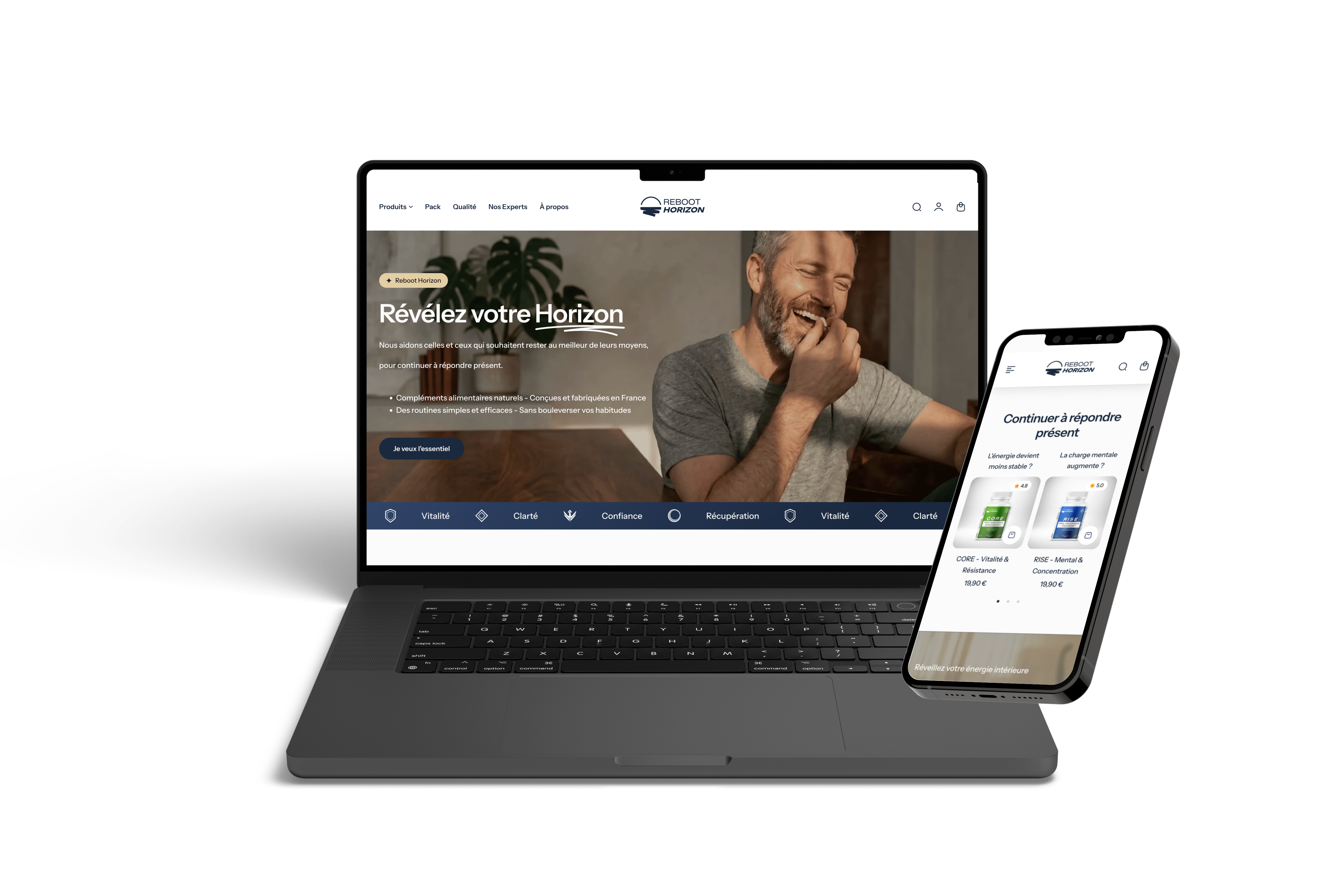

Reboot Horizon
An online presence truly aligned with the project — product included, e-commerce first.

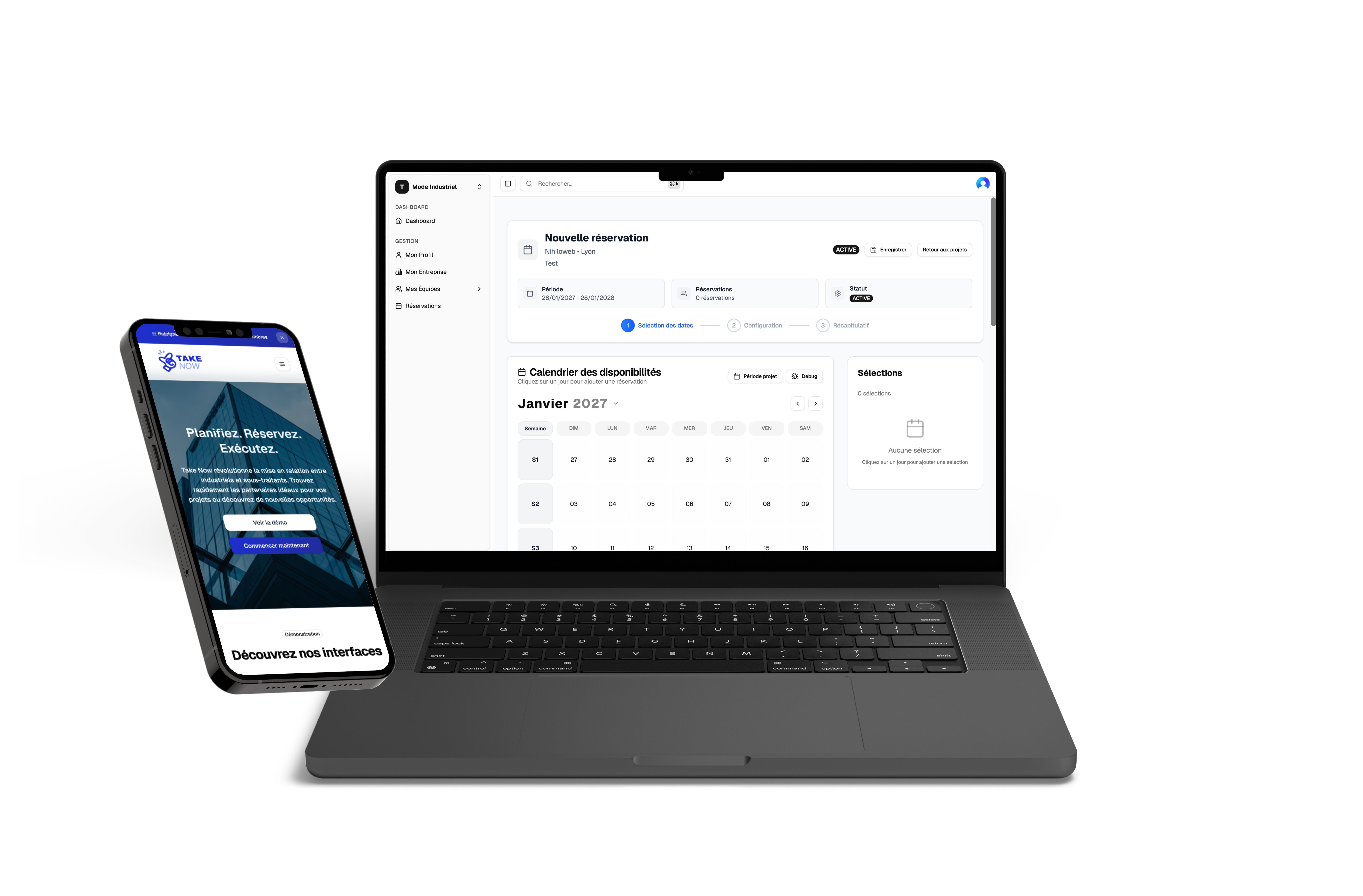

Take Now
Ops journey mapped with the teams. Dense but readable UI, through to real use.

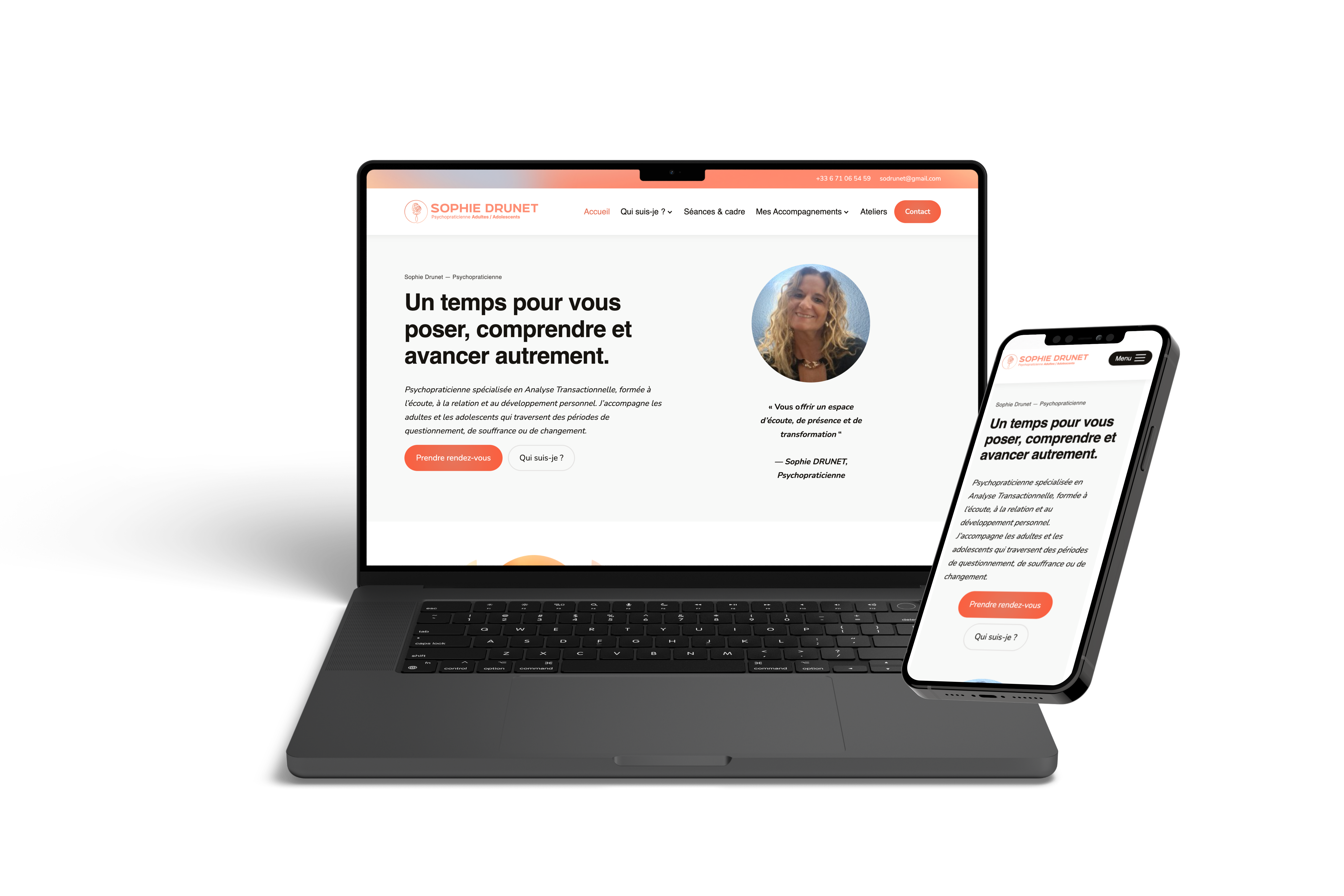

Sophie Drunet
The result matches 100% what I had in mind — without mockups first.

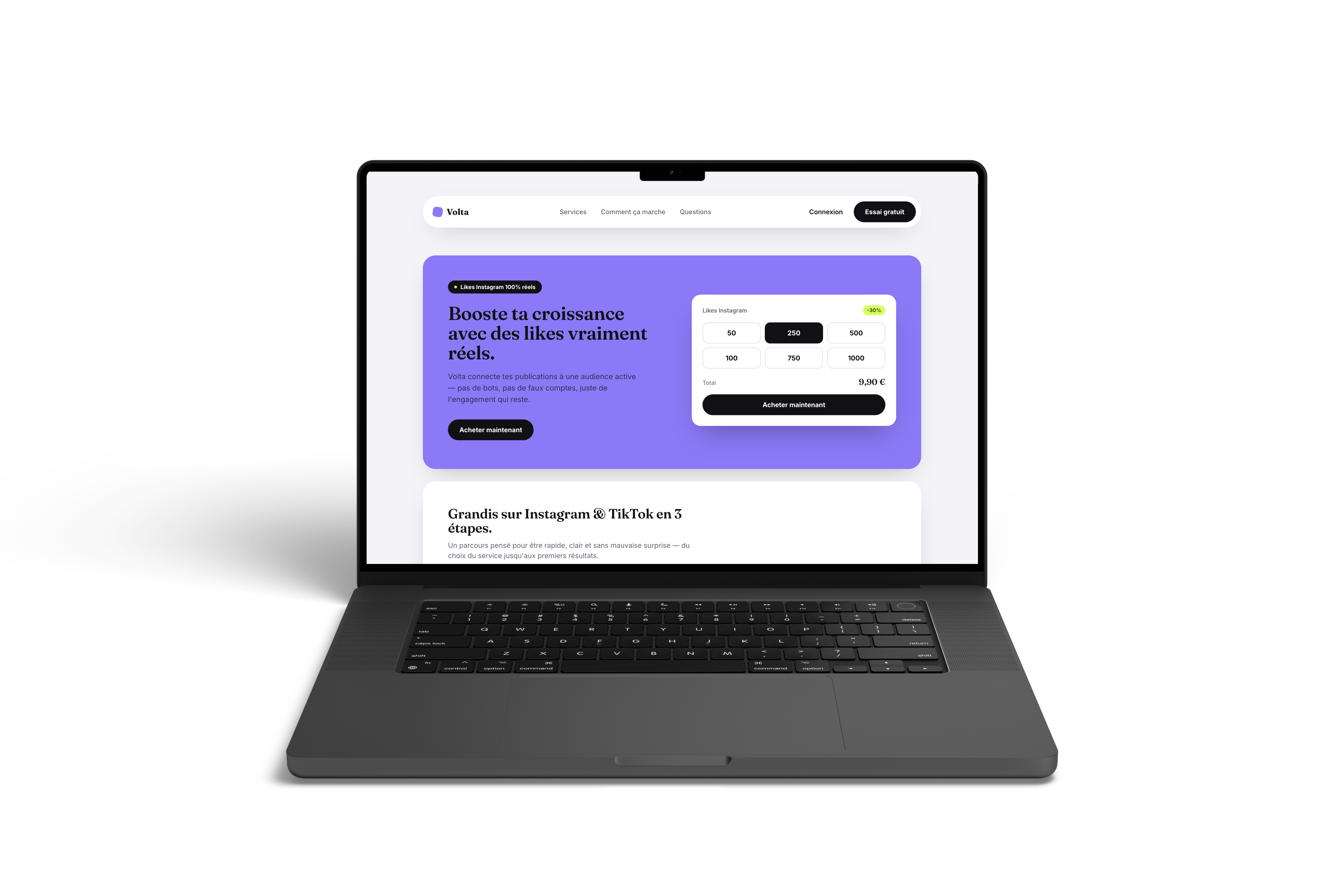

Volta
An open brief, short iterations. We kept the energy of the reference, with a Volta identity — light ground, no gradients, the exact violet.

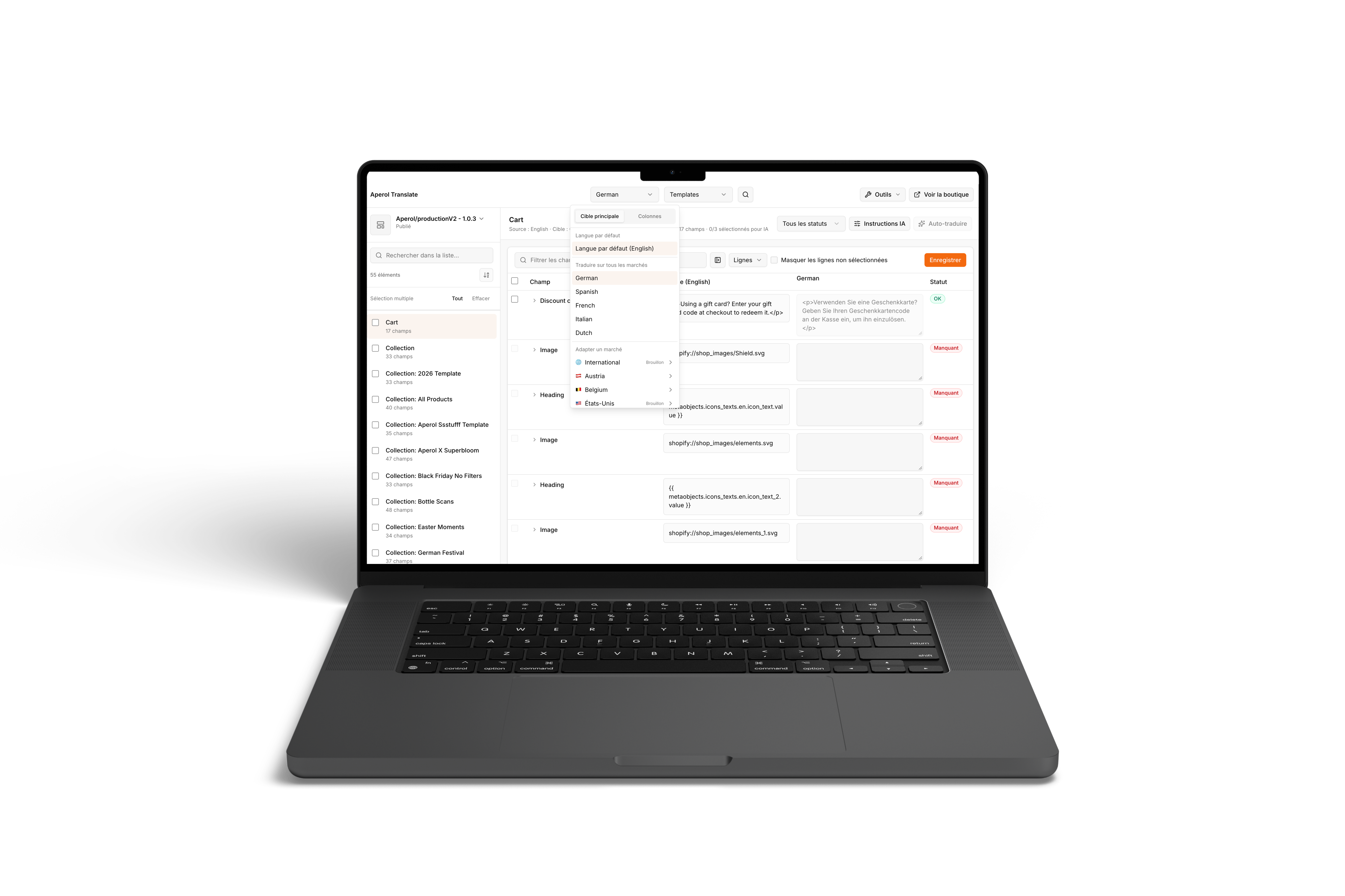

HA Translate
Several languages in the same interface. The AI holds the tone, the teams skip the back-and-forth.

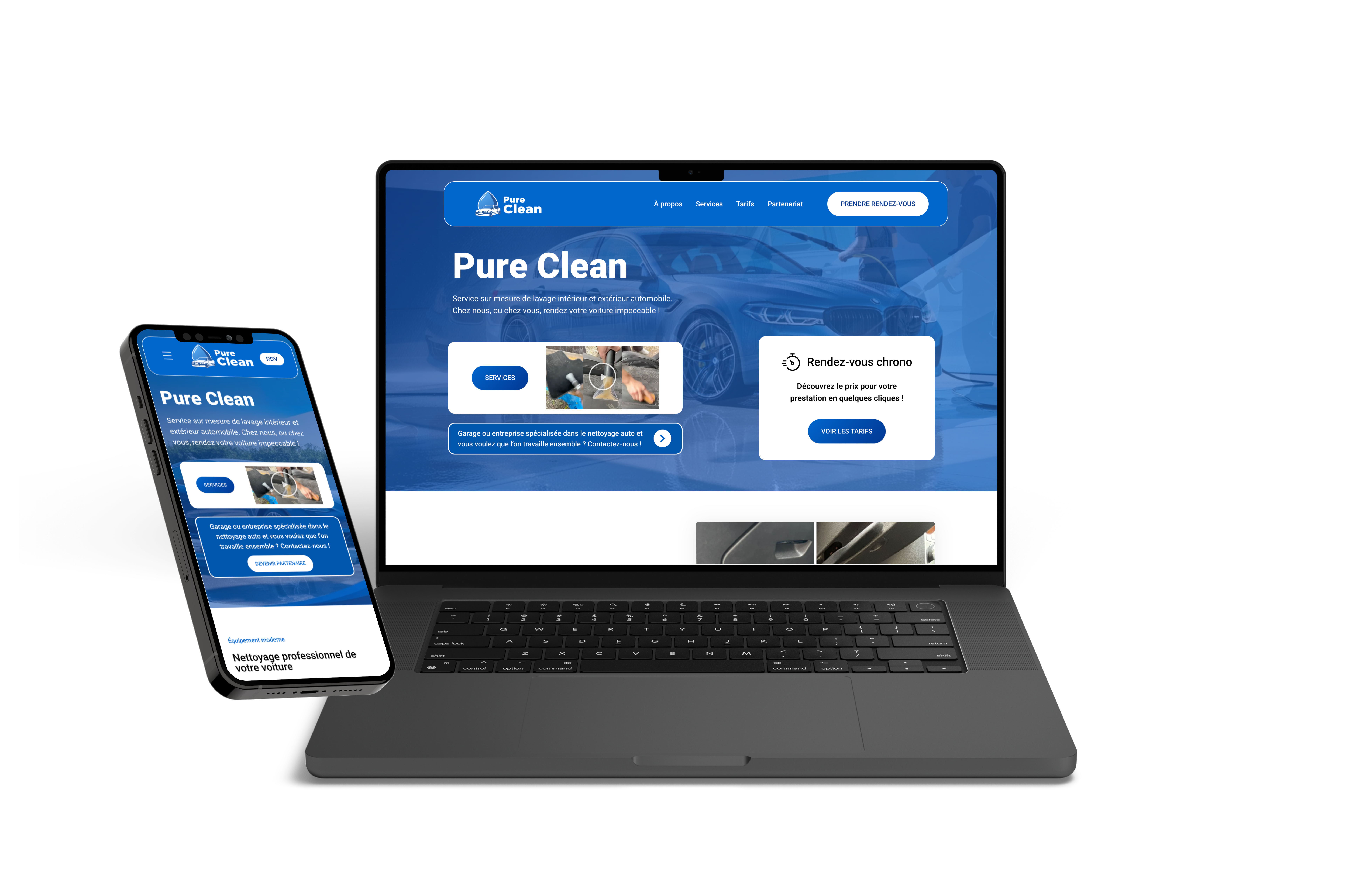

Pure Clean
Readable in seconds, booking on the first screen. Local search finally converts.

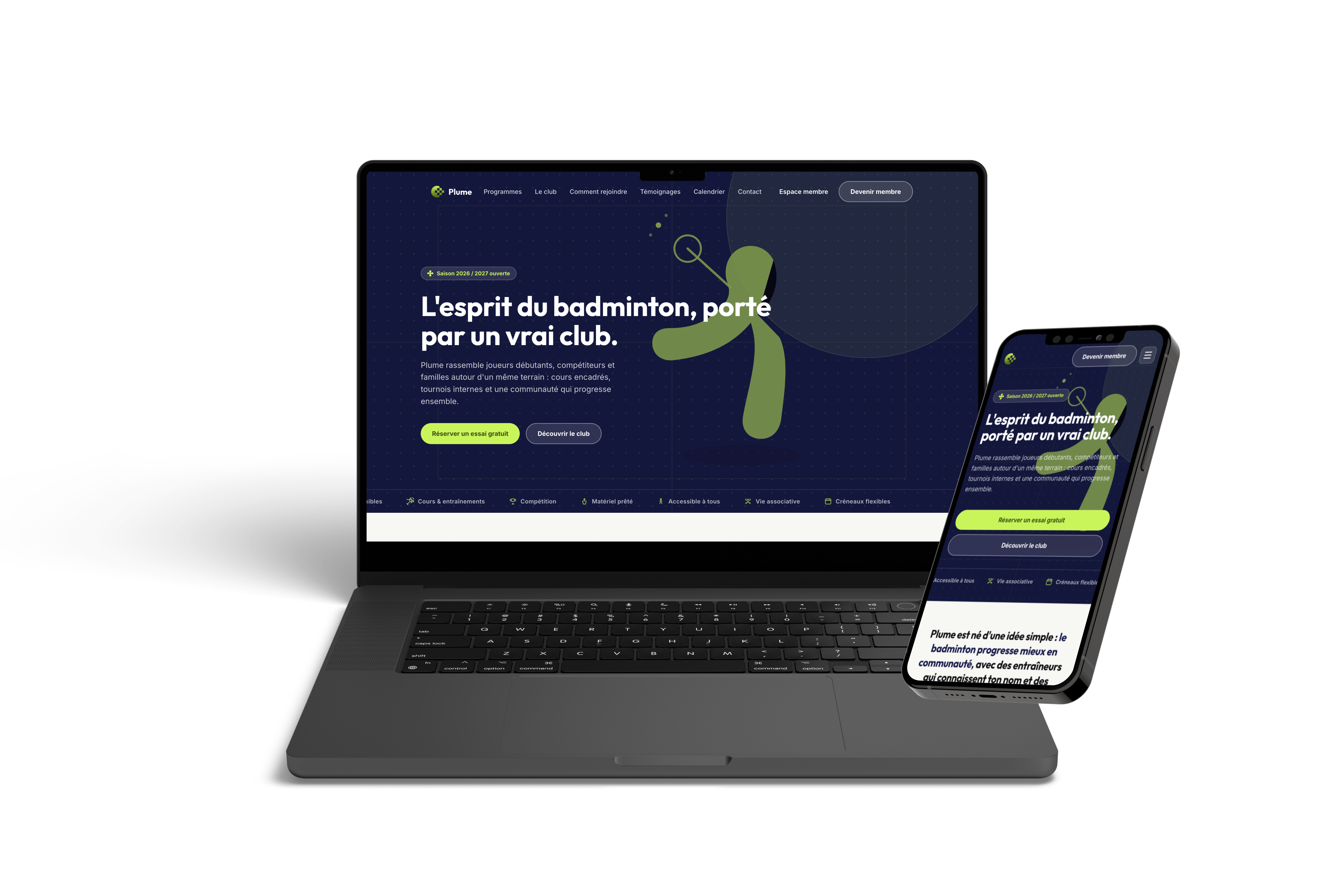

Plume
We started over. You see it at once: this is Plume, not the old site in a new color.